Playbook Sports
My internship experience.
Purpose
I had the opportunity to be a UX/UI Intern for a tech startup called Playbook Sports. There, I worked with the product solutions team to improve the usability of and standardize the visual design of the website.
Duration
May ’24 – Aug ’24
My roles
UX/UI Designer
Wireframing
Prototyping

The problem
Playbook is a management platform that helps coaches handle registration, payments, scheduling, and more. Coaches manage their teams through the back end, while parents and players access team info on the front end. This dual-audience structure means usability issues affect both groups.
If parents are confused, they ask coaches, and if coaches are also unclear, they come to us. This cycle creates friction and degrades the user experience.
The Solution
Our approach was to reduce confusion and improve usability so both coaches and parents can navigate the platform independently and effectively.
The Experience
During my internship, I learned how to navigate cross-functional collaboration, balancing the needs of different teams to create effective UI solutions. Working with customer inquiries and front-end developers, I gained insight into how user feedback translates into design improvements and the challenges of implementing those changes.
Presenting iterations to the product solutions team taught me how to articulate design decisions, incorporate feedback, and align usability best practices with business goals. Additionally, documenting UI components reinforced the importance of consistency in visual design and how standardization can streamline development. This experience deepened my understanding of how design, development, and user needs intersect in a real-world product environment.
Work Samples
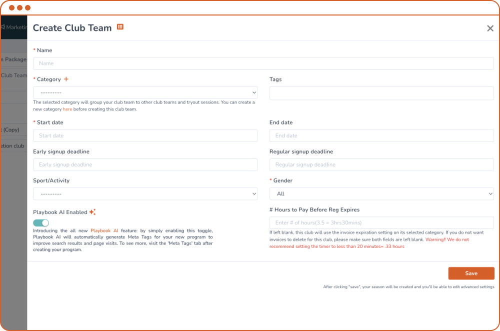
Boost engagement
We wanted to increase the use of the AI feature available to users when creating new sports programs. I found that the previous design didn’t highlight the feature or its purpose unless the info icon was being hovered over.
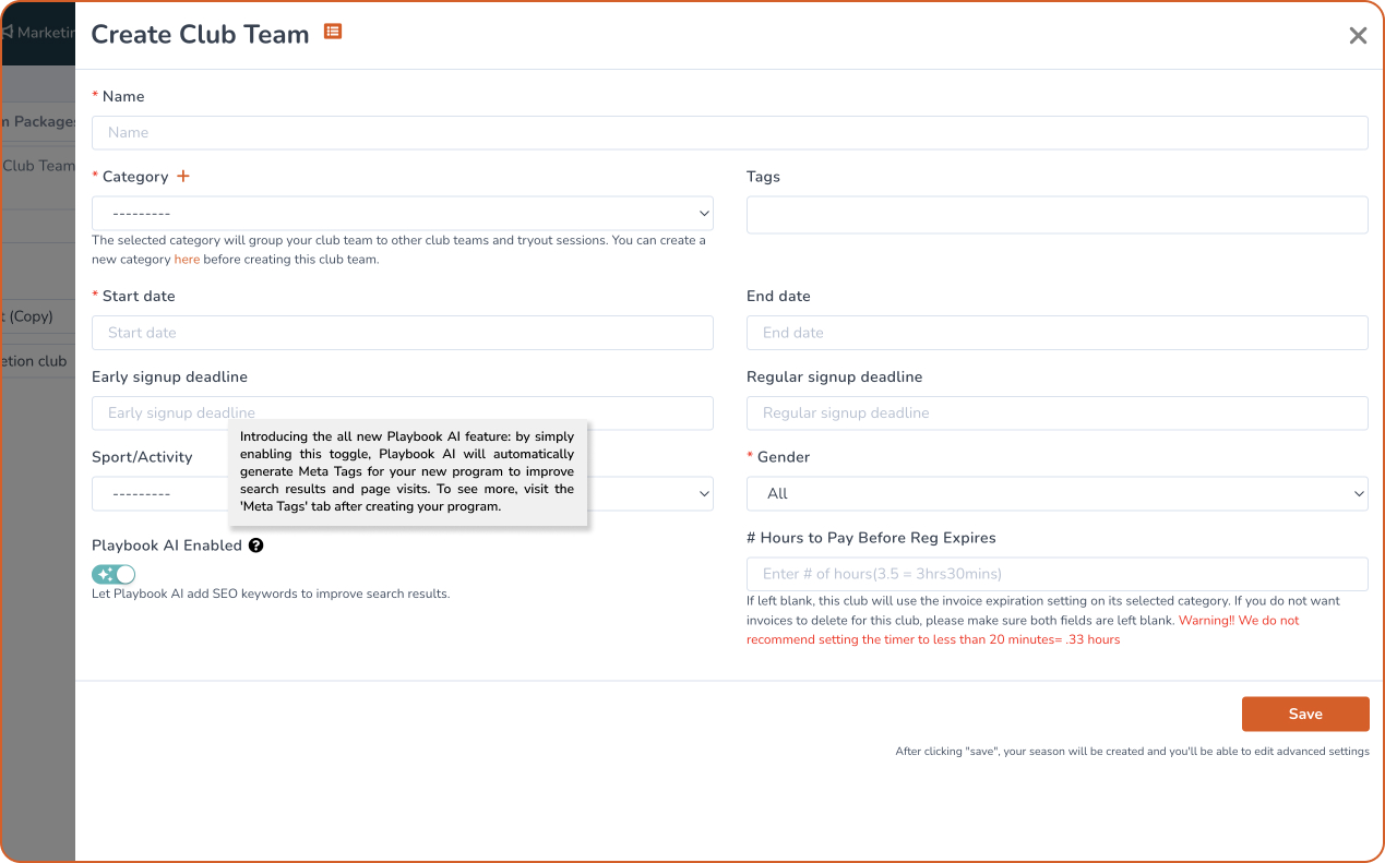
It’s all in the details. After iterating through designs, I decided that moving the description and icon would bring more attention to the feature. Using the brand’s accent color calls attention to the feature, similarly to other areas on the site.
Reducing User Friction
There was an influx of users inquiring about where they entered coupon codes. The option was included before checkout, during registration. Since coupons are associated with payment, users tended to look for the input field during the checkout process instead.
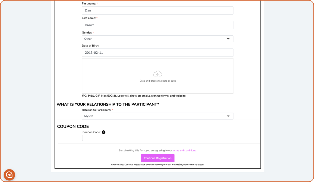
Due to system constraints, changes cannot be made to the payment amount due after registration. In turn, my approach was to provide customers with another opportunity to apply a code during the review. The newly added link appears during the review step and, on click, takes users back to registration, where the coupon code can be entered.
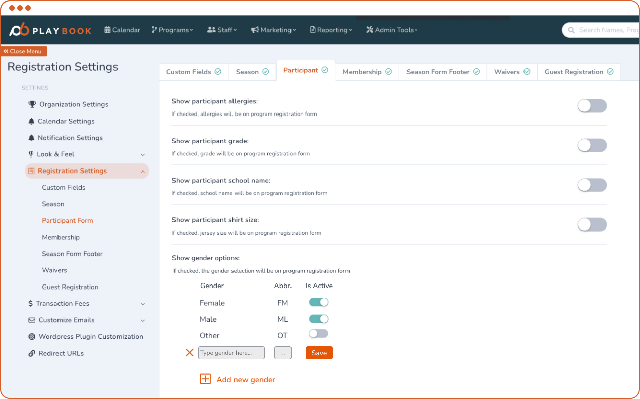
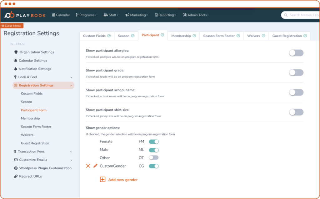
Increasing inclusivity
One of the company’s goals was to make the platform more inclusive and customizable. To do this, we implemented a feature that allows the creation of custom gender options to be included during registration.